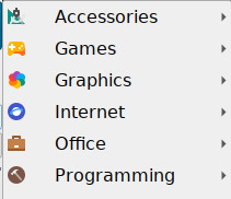
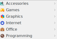
I don’t know if this was intentional, but I’ve noticed a difference in menu item left-padding between the item icon and the item text, depending on which theme you choose.
e.g
padded (Light)

unpadded (Kde-Plasma)

This is on 22.04 and probably 22.10 (i can’t remeber 20.04).
And here is a summary;
Ambience		padded
Arch-Colors		padded
ClearLooks		not padded
Dark			padded
Frost			padded
Kde-Plasma		not padded
Kvantum			padded
Leech			not padded
Light			padded
Lubuntu Arc		not padded
Silver			not padded
System			not padded
Valendas		not padded
For anyone who wants to change the padding;
Just edit the below item in
/usr/share/lxqt/themes/<theme>/lxqt-panel.qss
QMenu::item {
    color: palette(text);
/*    padding: 5px 27px; */
}